← All Guides
Using the Widget Designer
The widget designer is where you create your widgets. While templates can often get you close to the widget you want, you'll likely need to customize further. Therefore, knowing how the widget designer works is very important.
Adding Elements
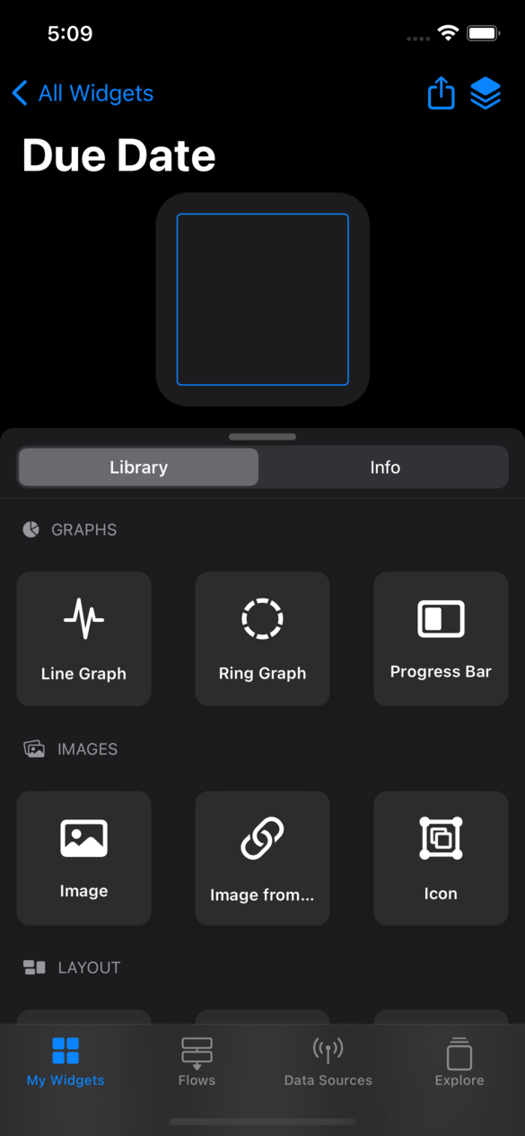
The widget designer is split into two tabs: Library and Info. The library shows every visual element you can add to your widget.
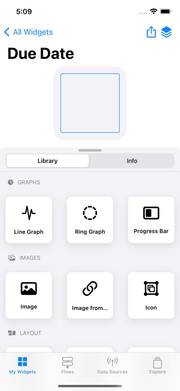
There are two ways to add an element from the list to your widget:
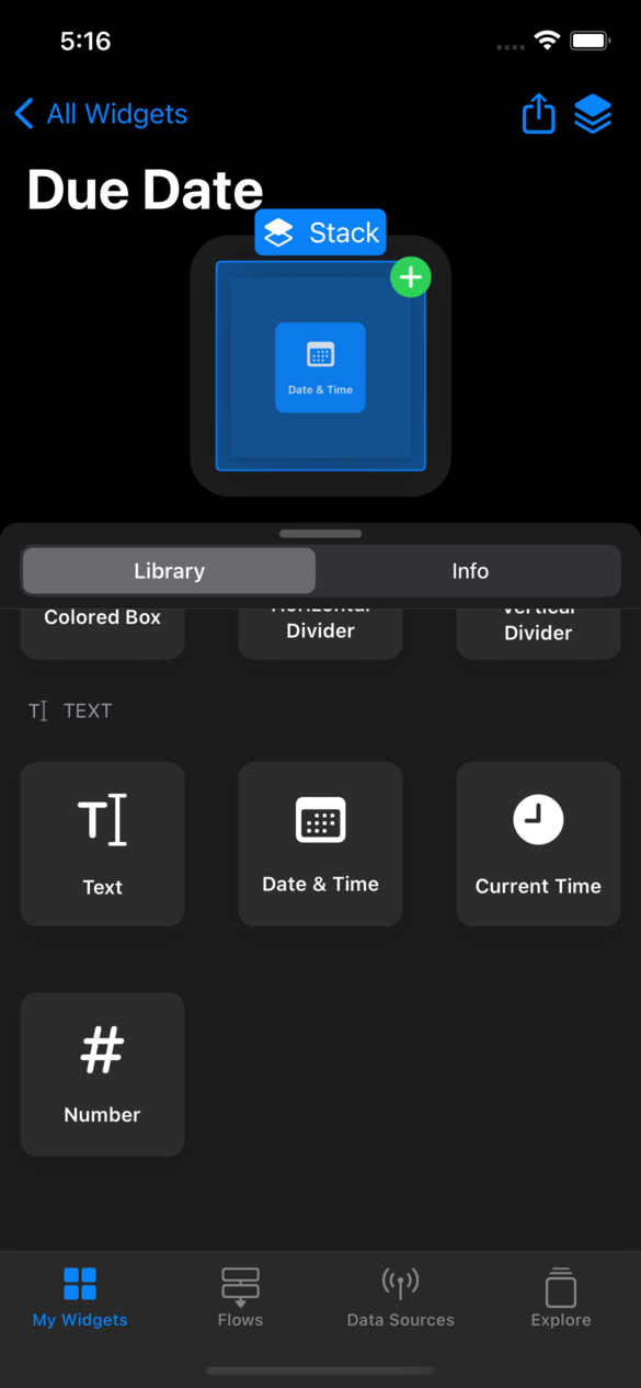
- Tap and hold on an element in the library to pick it up, then drop it somewhere on the widget.
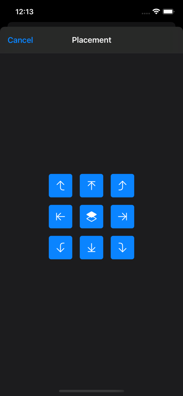
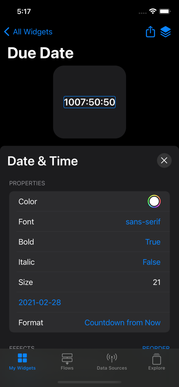
- Tap on the element, and select it's placement. It will be placed relative to the highlighted element (the highlighted element will have a blue border). Tap on any element on the widget to highlight it.
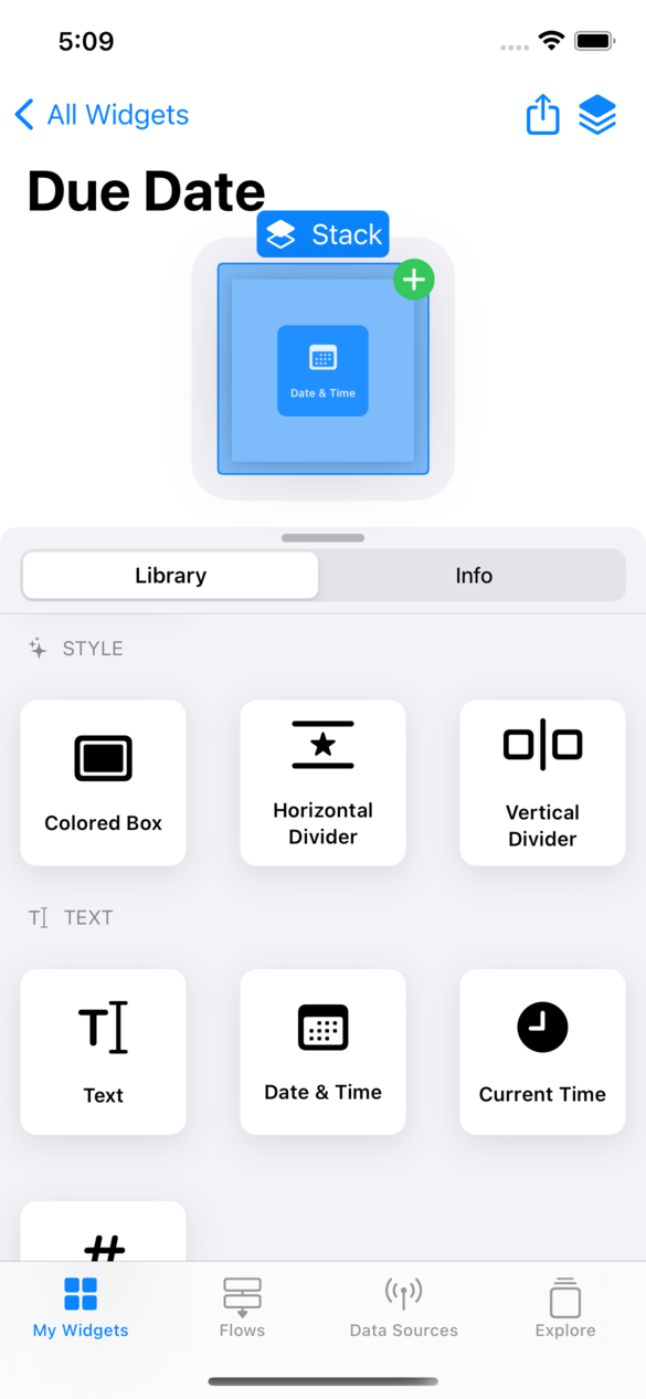

Dragging and dropping is typically easier, however certain elements may be difficult to place perfectly due to their size. You can pinch to zoom in on the widget if necessary.
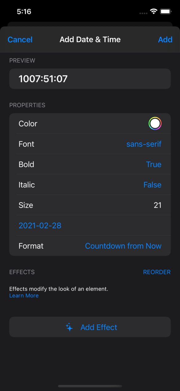
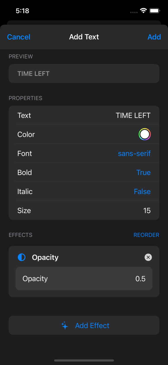
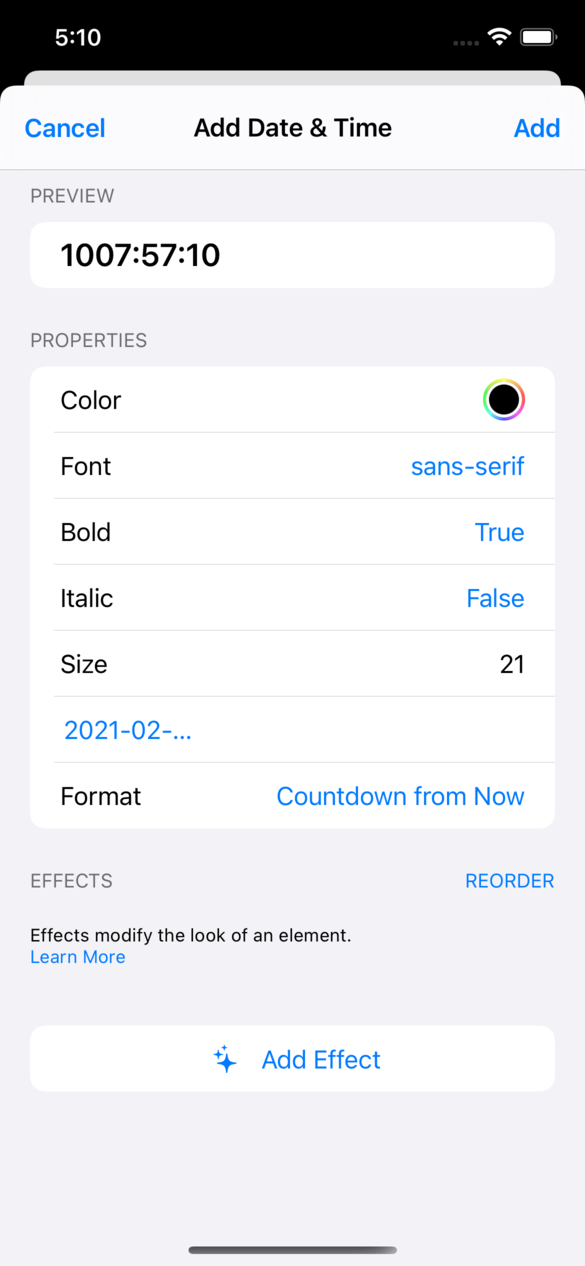
After choosing the placement of an element, either via drag and drop, or the placement selector, a sheet will appear that allows you to fill in the content of the element. For instance, when adding a Text element you are able to type the text you want, the color of the text, the font, font size, and more. After filling out the fields, tap "Add" to add the chosen element to the widget.

Placing Elements
When dragging and dropping, a blue line will show the chosen placement. Each placement has a name, and correspond to different layouts:
Align Left - This placement allows you to position an element in a left-aligned column with another element. You can think of it as text in a Word Processor. Align Left is equivalent to left justification.
Align Right - Similar to Align Left, this is equivalent to a right justification.
Stack - This places on element on top of another.
Place Left - This places the element on the left side of another element.
Place Right - This places the element on the right side of another element.
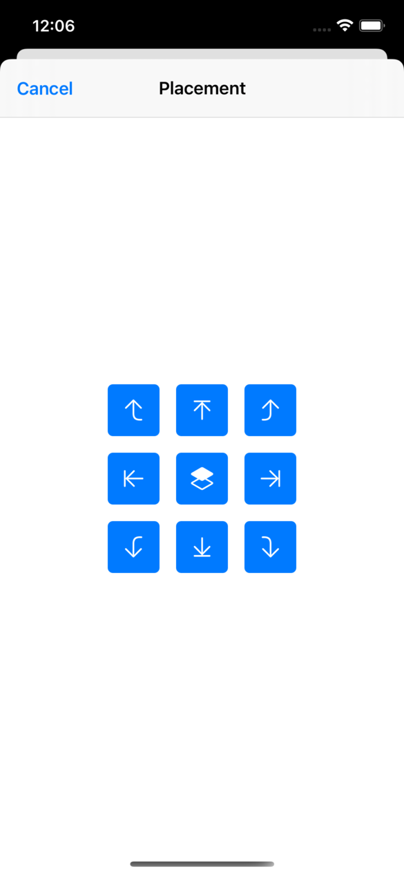

Try out the different placements to get a feel for how they place the various elements.
Editing Elements
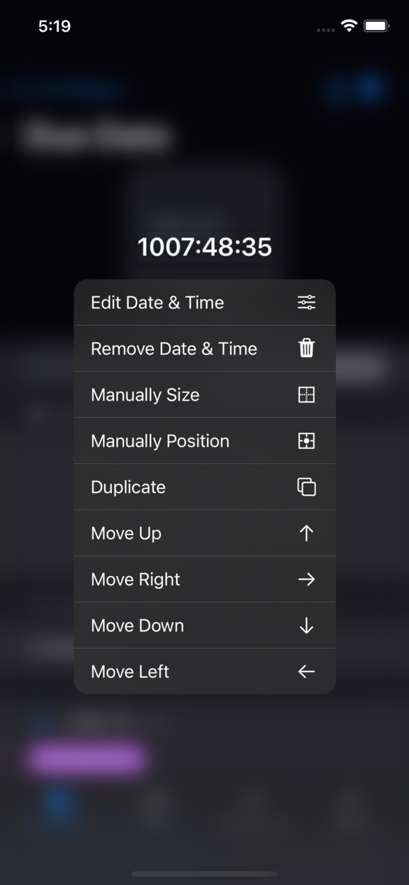
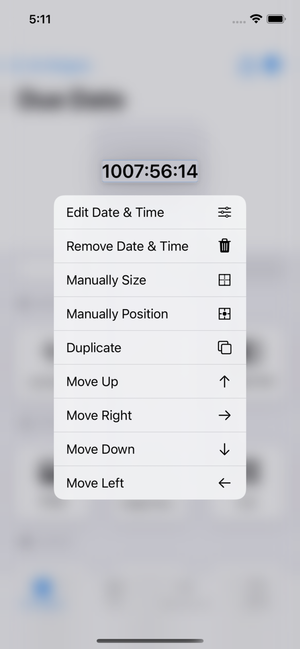
Long press on any element to bring up a context menu with various options. There you can Edit, Remove, Duplicate, and Move the element in various ways.
Edit - This opens the sheet you used to add the element, and allows you to adjust any information you had previously provided.
Remove - This removes the element from the widget.
Duplicate - This creates a copy of the element and places it immediately below/next to the original.
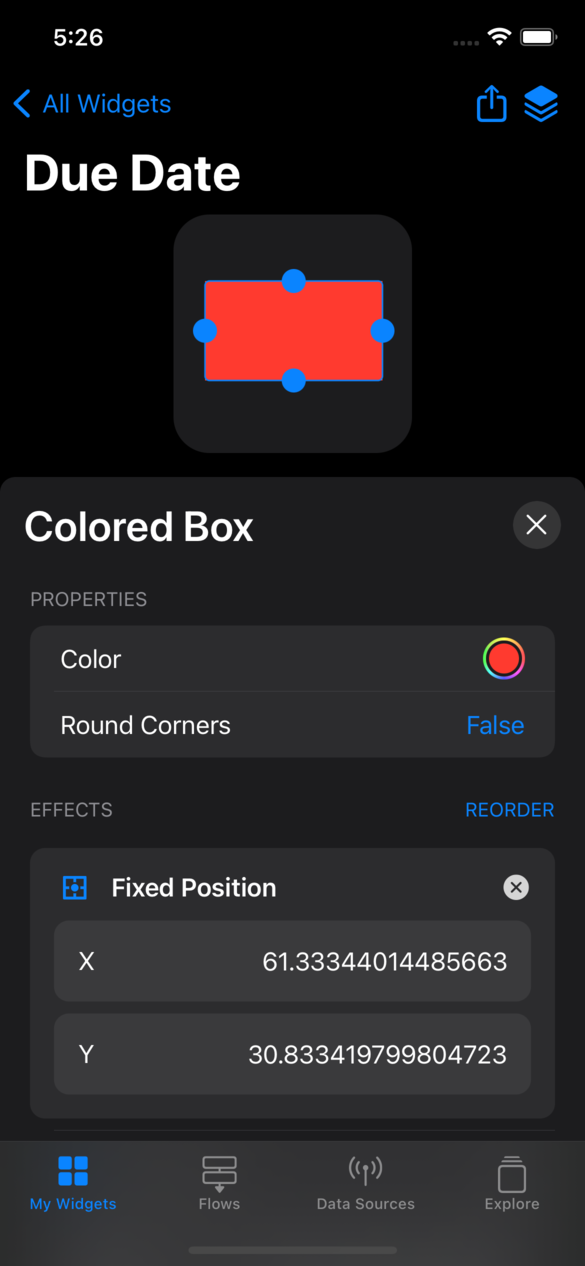
Manually Size/Manually Position - These are shortcuts to adding the "Fixed Size" and "Fixed Position" effects.
Move (Up/Right/Down/Left) - This shifts the element in your widget's layout. For instance, if you had two Text elements aligned left, and you tapped "Move Down" on the first one, it would be moved below the second element.

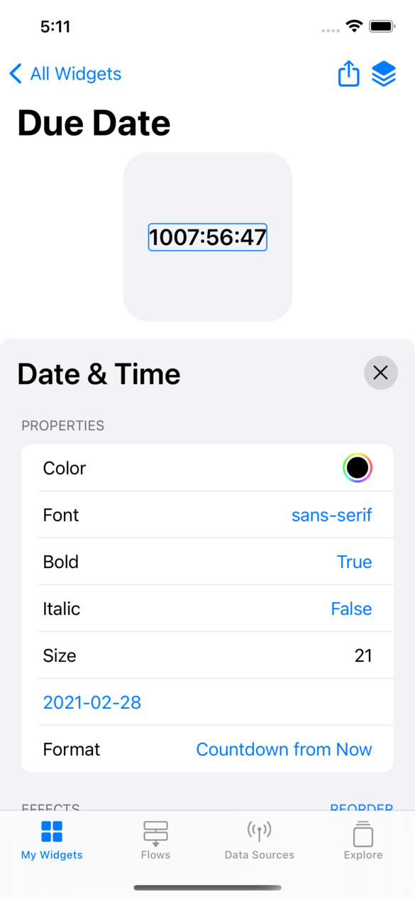
Any time you tap on an element in the widget, the bottom of the screen will show all the properties you can edit. Any changes made there will update live.

Adding Element Effects
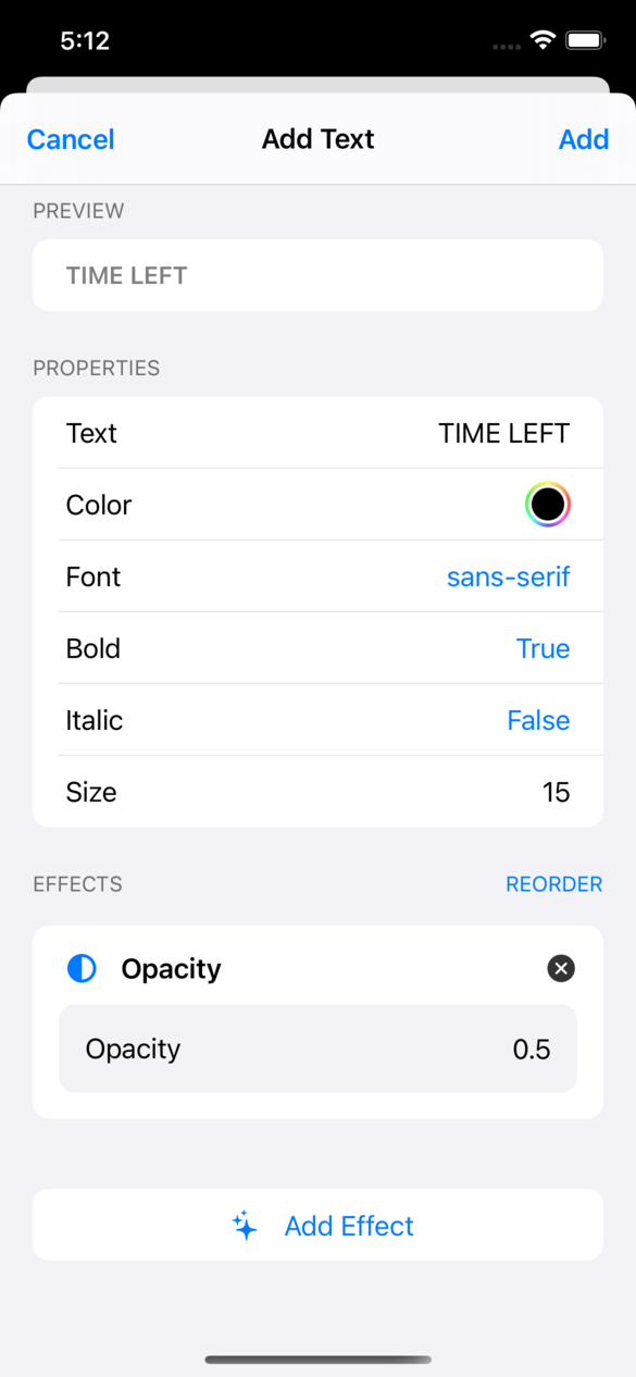
Effects modify the look/style of an element. There are a variety of effects you can apply:
- Scale - Increases/decreases the size of an element by a specified amount.
- Rotation - Rotates an element by a certain number of degrees.
- Opacity - Reduces the opacity of an element. For instance, a value of 0.5 will result in a half-transparent element.
- Background Color - Changes the color of the background immediately behind the element.
- Round Corners - Rounds the corners of the element to a specified radius.
- Blur - Adds a blur to the element.
- Margin - Adds space around the element.
- Offset - Shifts the element a certain number of pixels in a direction.
Tap "Add Effect" to choose from the list. The effect will appear in a card in the "Effects" section. Tap the (x) to delete the effect.
The order you apply effects in is very important. For instance, if you add a "Margin" effect, followed by a "Background Color" effect, the background will color the space behind the margin. However, if the "Margin" occurs after the "Background Color", then the space added by the margin will not have the background color. You can tap "Reorder" to change the order effects are applied in.

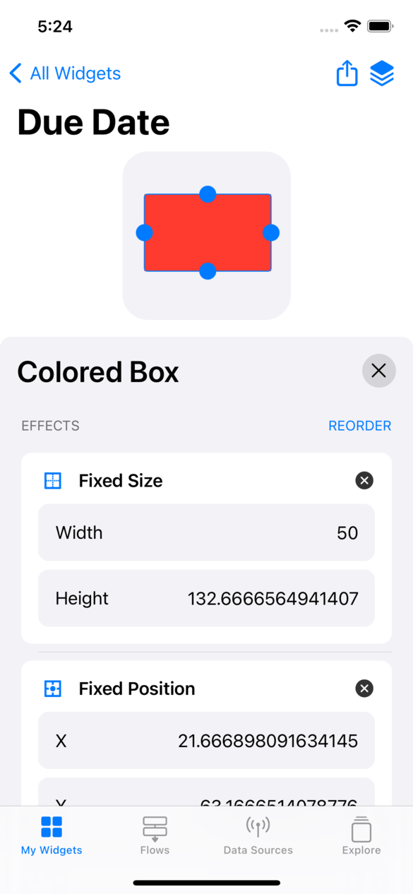
There are two effects with special abilities as well: Fixed Size and Fixed Position. Fixed Size allows you to manually specify the size of the element, instead of letting Power Widgets determine it automatically. Fixed Position allows you to place the element anywhere on the widget, ignoring the layout Power Widgets applies automatically. When Fixed Size is added, handles appear on the element which you can drag to change the size interactively. Similarly, when Fixed Position is added, you are able to drag the element around the widget to place it.
It is recommended to use the automatic layout (as described in Placing Elements), as it will scale to different devices automatically when sharing.

Customizing the Widget
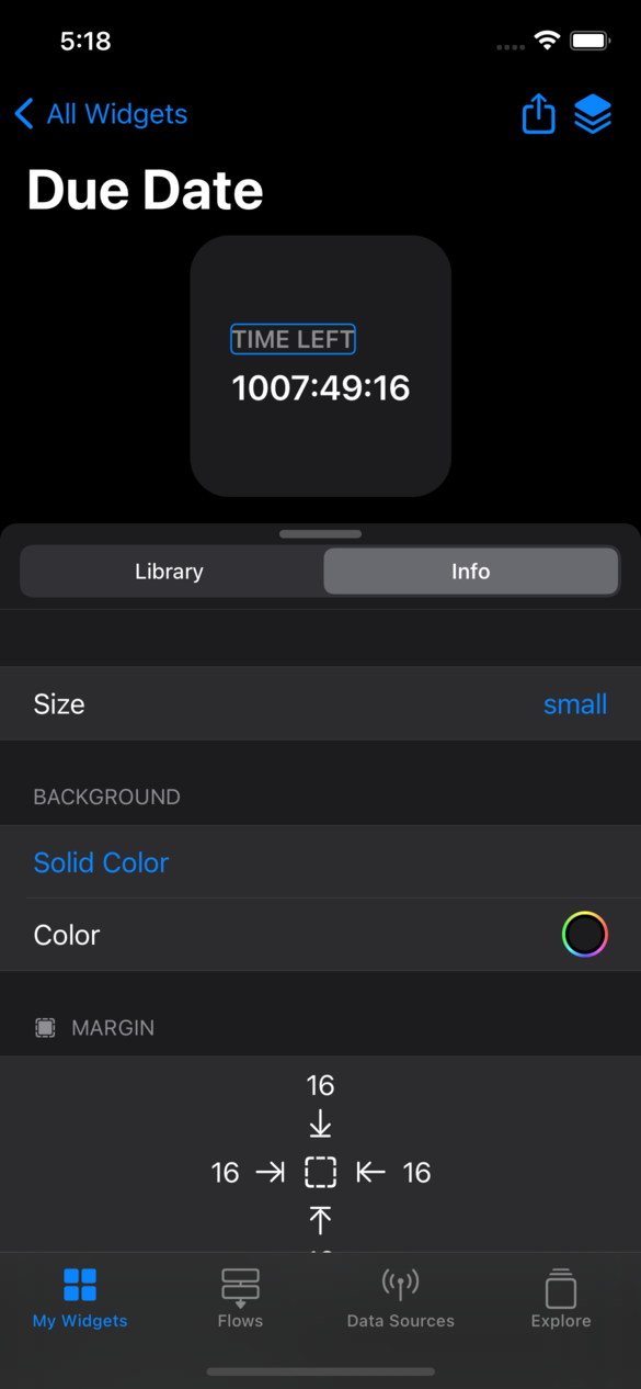
Not all customizations can be done using visual elements. Use the Info tab to edit settings for the entire widget, such as size, background color, and margins.
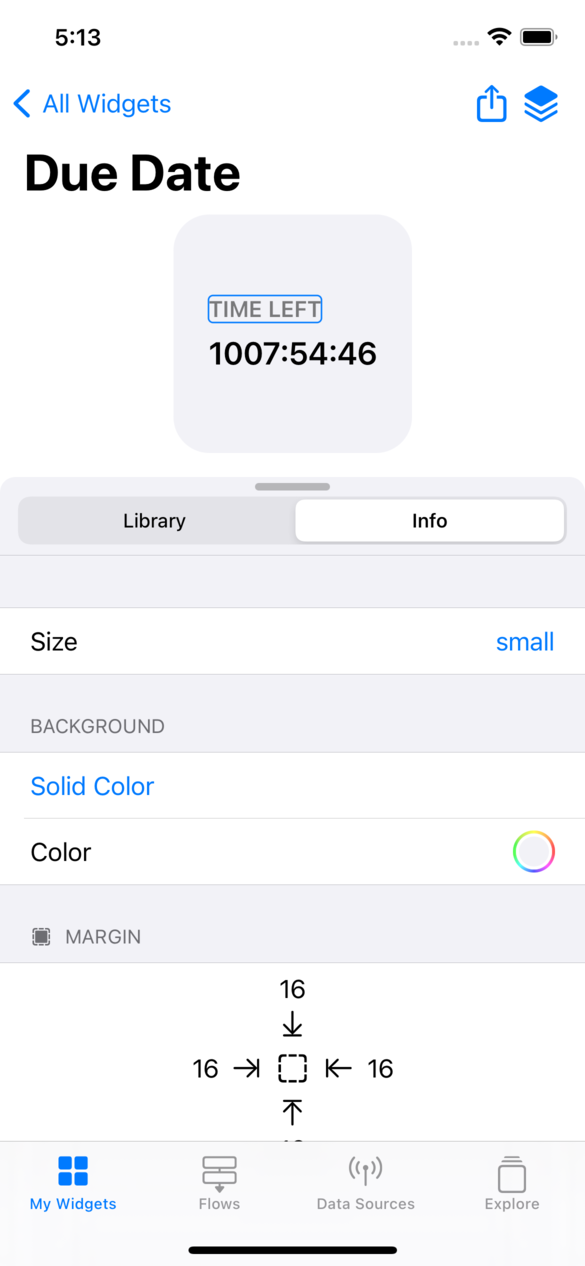

Size - There are three sizes available: Small, Medium, and Large. When adding the widget to your homescreen, be sure the size you add matches the size in the designer.
Background - There are four different background options for your widget: Solid Color, Linear Gradient, Radial Gradient, and Wallpaper-Matched. Wallpaper-Matched allows you to easily create a widget with a background that seamlessly matches your phone's wallpaper.
Margin - Margins allow you to set how close the elements are to the edge of the widget.
Connected Flows - Tap on a flow to connect it to your widget. Any outputs from the flow can be accessed from your elements (Learn More).
Links To - Setting the URL here tells Power Widgets what your widget should do when tapped. You can either provide a URL to a website, or choose a Siri Shortcut to be run when your widget is tapped.
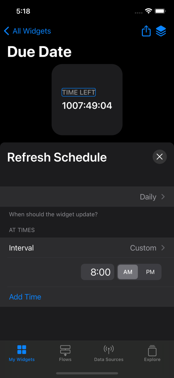
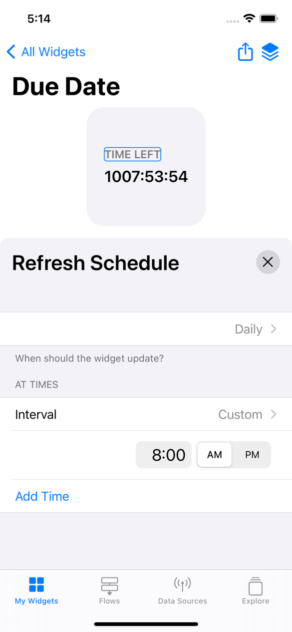
Update Schedules - Refresh and Relevance Schedules help iOS know more about your widget. The Refresh Schedule tells iOS when your widget needs to be updated. For instance, if you create a weather widget, you can tell iOS to update it every hour so its always up to date. The Relevance Schedule lets iOS know when your widget is most useful/important, and will therefore make it the topmost widget in a Widget Stack.
Setting up a Refresh Schedule does not guarantee that your widget will update. iOS ultimately decides if the widget should be updated or not, but will never update more frequently than specified.

Viewing the Layout
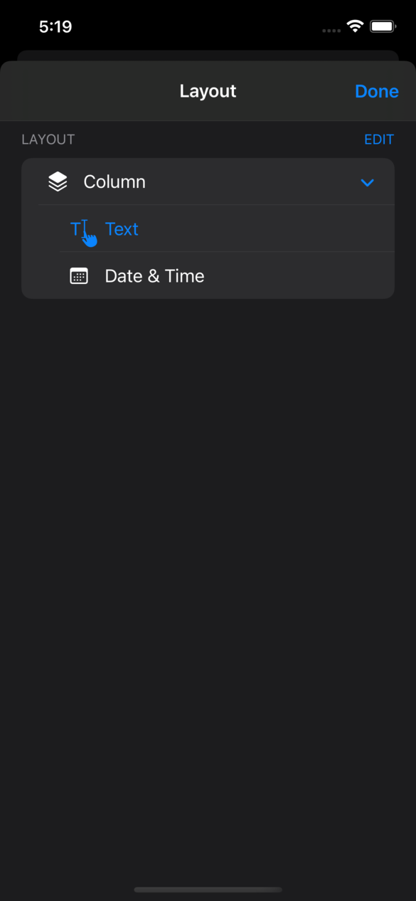
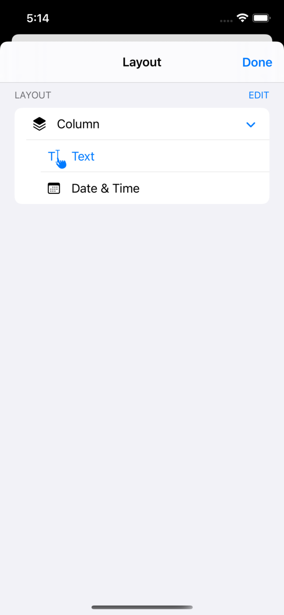
Tap the stack icon in the upper-right corner to view the full layout of your widget. You can long-press on any of the items in the layout to edit. As you can see, Power Widgets uses the placements you choose when adding elements to intelligently identify when to add Rows, Columns and Stacks to your widget. If you are ever puzzled by the layout when adding elements, this screen can help decipher it.

Once you're done desigining your widget, you can head to the Home Screen to add it.
Next
Adding Widgets to the Home Screen ›
